Blog/Product
Better bandwidth graphs
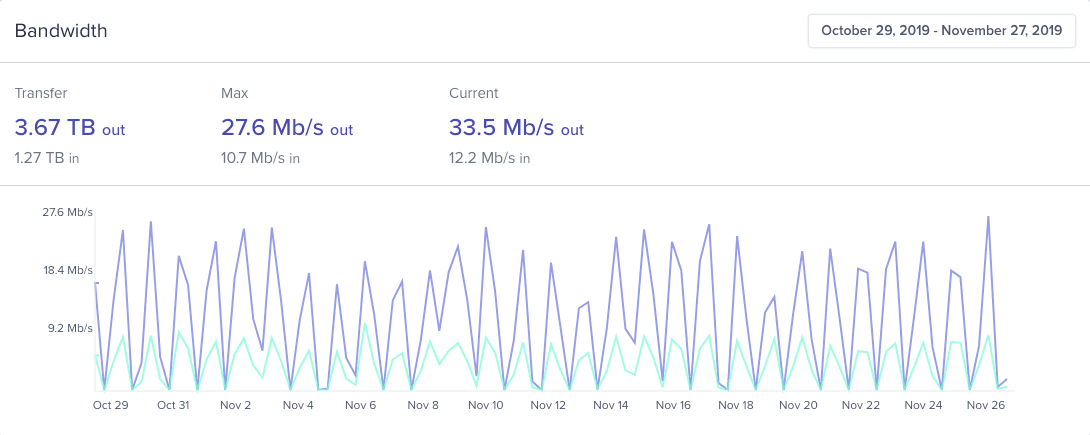
Measuring and understanding your traffic is an important part for sizing your infrastructure and keeping costs under control. Today, we're excited to launch new bandwidth graphs. They are much faster and easier to read, and were built from the ground up to help you make more sense of your traffic.
Key metrics
These are the most important metrics to help you understand what went on during the selected period. The Max value is the max speed hit by the server during the period, and Current is the speed at the present time.
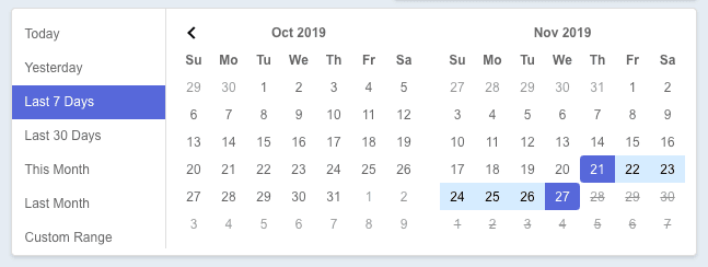
Preselected period and custom ranges
It can be useful to look at different periods to see how your traffic behaves. You now have a wider range of predefined date periods to quickly navigate your graphs, and you can also select custom periods.
Availability
The new graphs are available for all accounts—just go to your server's bandwidth page. If you have feedback or feature requests, click on the Feedback option under the Support icon. We're looking forward for your ideas on what we should tackle next.